
-
Caption Text
Link -
Caption Text
Link -
Caption Text
Link -
Caption Text
Link -
Caption Text
Link -
Caption Text
Link -
Caption Text
Link -
Caption Text
Link -
Caption Text
Link -
Caption Text
Link -
Caption Text
Link
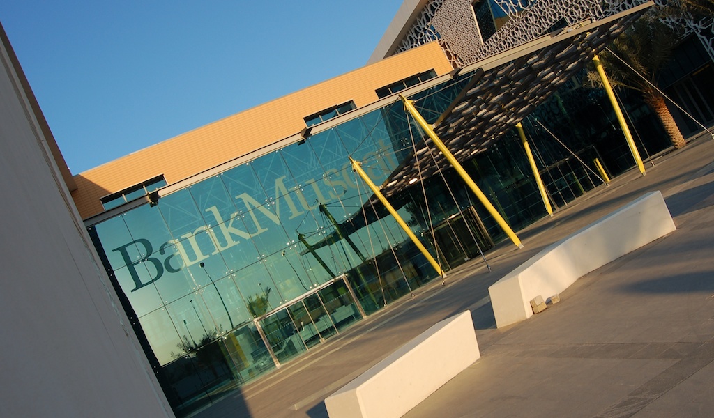
BankMuscat Global HQ, Oman
We were appointed by BankMuscat to design and detail an external and internal wayfinding scheme for their iconic new corporate headquarters building in the Omani capital of Muscat. Our intention from the outset was to create a modern and effective wayshowing scheme which would integrate closely with the boldness of the architecture, and which would reflect the international aspirations of the bank. It was equally as important to us that the scheme would be effective for local and regional staff and visitors, and be culturally relevant.
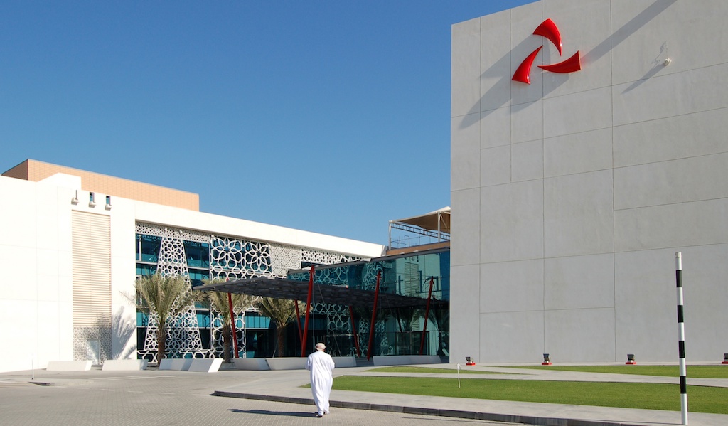
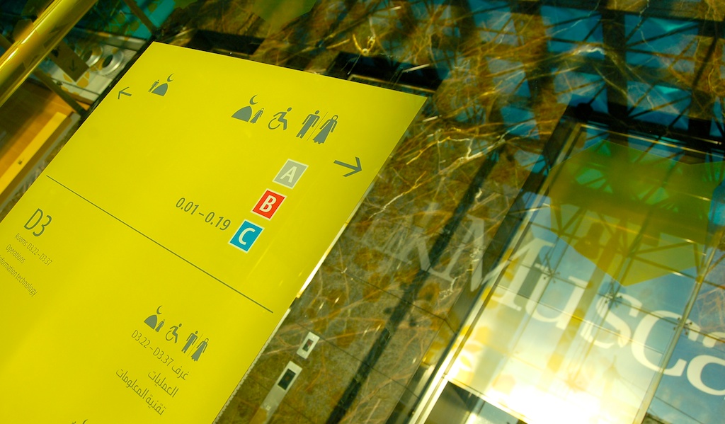
The building is composed of four distinct office blocks, connected at ground level by an internal public ‘street’ containing shops, restaurants and service offerings. Key bank departments are located on the upper levels which are accessed primarily from the 'street' via four main lift cores.
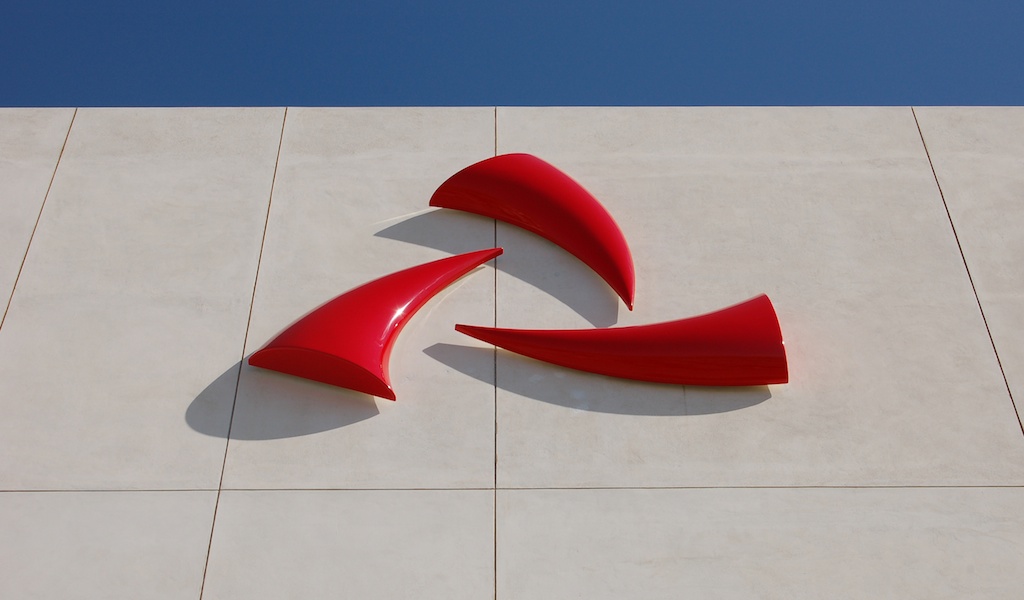
Externally we carefully located a small number of high level signs for distance visibility. We chose to represent only the graphic element (the 'Khanjars') of the bank logo, confidently dropping the English and Arabic logotypes (the brand is one of the most well-known in the region). This being the first ever 3-dimensional interpretation of the bank's logo, we realised it in GRP.
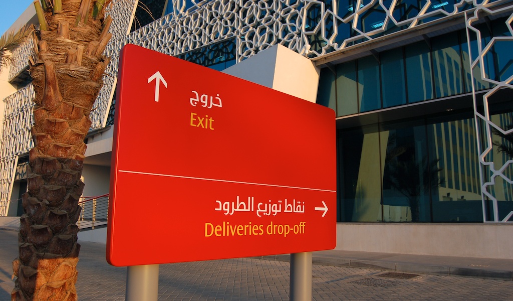
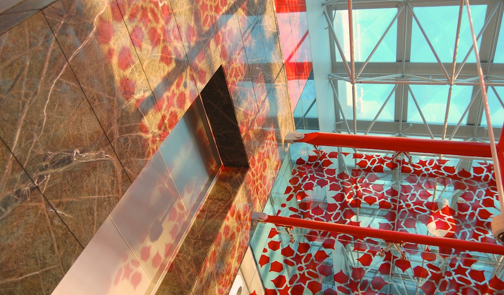
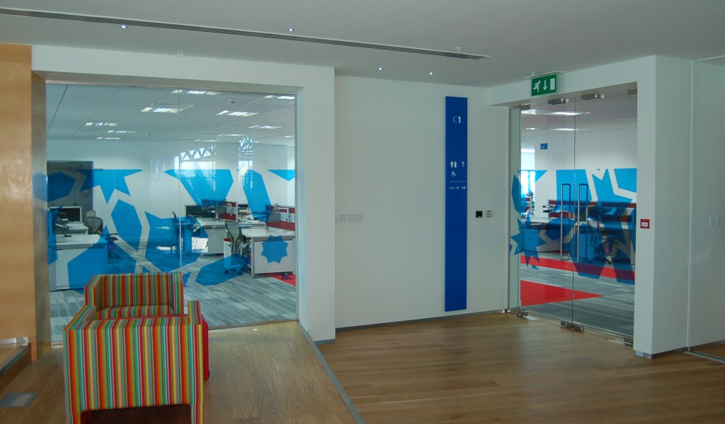
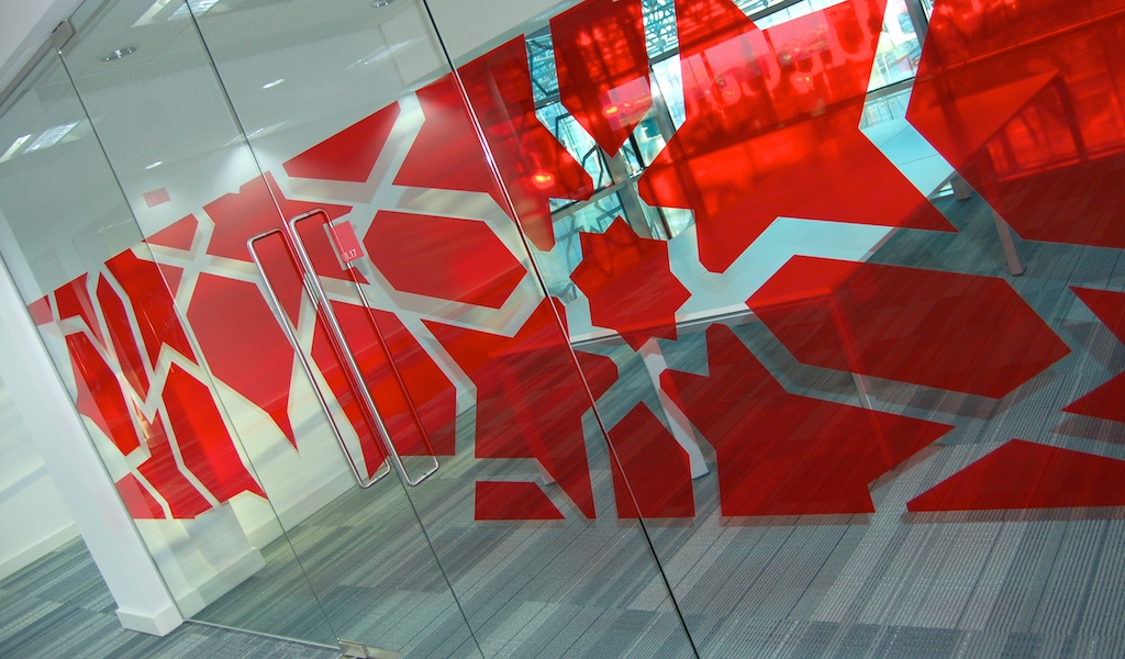
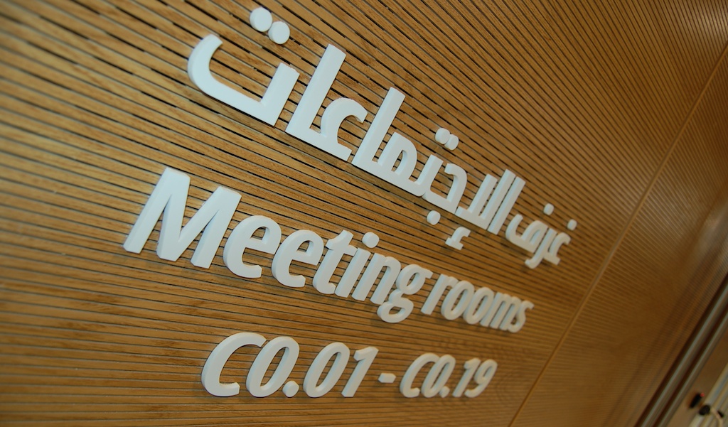
The bank's signature red colour is used externally but we chose to take a more interesting, playful and architectural approach internally. Developing a series of bespoke graphic patterns (based on an original islamic design), we applied these in a modern and colourful way, to the main lift cores. The colours are then applied vertically within each of the blocks on all directional and directory signs. Meeting rooms and glazed walls have the relevant patterns applied as a supergraphic.
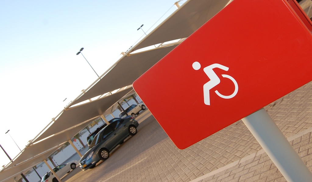
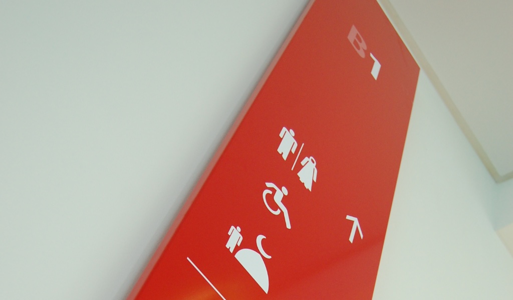
BigVesta and Berytus typefaces were selected for the dual language requirements. Messages were always communicated graphically rather than in dual language, wherever possible. This allowed us to simplify all communication, to ensure clarity and legibility. Bespoke pictograms were designed for key facilities such as toilets and prayer rooms, to establish a new modern and culturally relevant graphic language which would also be legible to international visitors.
The building is composed of four distinct office blocks, connected at ground level by an internal public ‘street’ containing shops, restaurants and service offerings. Key bank departments are located on the upper levels which are accessed primarily from the 'street' via four main lift cores.
Externally we carefully located a small number of high level signs for distance visibility. We chose to represent only the graphic element (the 'Khanjars') of the bank logo, confidently dropping the English and Arabic logotypes (the brand is one of the most well-known in the region). This being the first ever 3-dimensional interpretation of the bank's logo, we realised it in GRP.
The bank's signature red colour is used externally but we chose to take a more interesting, playful and architectural approach internally. Developing a series of bespoke graphic patterns (based on an original islamic design), we applied these in a modern and colourful way, to the main lift cores. The colours are then applied vertically within each of the blocks on all directional and directory signs. Meeting rooms and glazed walls have the relevant patterns applied as a supergraphic.
BigVesta and Berytus typefaces were selected for the dual language requirements. Messages were always communicated graphically rather than in dual language, wherever possible. This allowed us to simplify all communication, to ensure clarity and legibility. Bespoke pictograms were designed for key facilities such as toilets and prayer rooms, to establish a new modern and culturally relevant graphic language which would also be legible to international visitors.